
First Published 18 Nov 2022
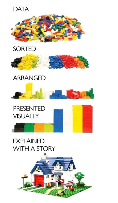
The differences between raw data and how it is presented . . .
With thanks to Andreas von der Heydt on Linked In
The graphic provoked some lively discussion.
For example, many commented that most of the red and yellow Lego bricks were missing in the final image! :~)
I particularly liked this summary comment by Drue Kendrick
So much great discussion from this visual!
I agree with the commenters who have argued that the storyteller adds bias.
That person selects the data that supports the story they want to tell.
Sometimes their interpretation illustrates a skewed picture, as seen in the lego house missing the majority of yellow and red lego pieces.
Keeping your audinece in mind must be part of this discussion.
Who needs to know what, when, and why?
Which data should be collected? Who decides?
Which data should be applied to enable specific decisions or outcomes?
How do we prevent data from being misused?
Colin Riddington Mendip Data Systems 18 Nov 2022
|
Return to Access Blog Page
|
Return to Top
|