First Published 23 Nov 2024 Difficulty level : Easy

Section Links:
Introduction
New Chart Type
Pareto
Future Developments
New / Improved Features
Sorting
Gridlines
VBA Support
Conclusions
Video
Feedback

Introduction
Return To Top
The improvements to the Modern Charts were rolled out to current channel users in late September with version 2409 build 18025.20104.
Since then, the feature has continued to evolve in response to user feedback and suggestions for additional functionality.
Many thanks to the Access team member responsible for this feature, Courtney Owen, who has been very responsive to making changes which further improve the usefulness of this feature.
The first part of this article focused on the features available in the initial release to the current channel in late September and early October.
This second part of the article discusses the additional changes made subsequently from November 2024 onwards.
Unless stated othewrwise, all items on this page are now available in the Beta Channel version 2412 build 14311.20000 or later and will be released to the Current Channel in the near future.

New Chart Type
Return To Top
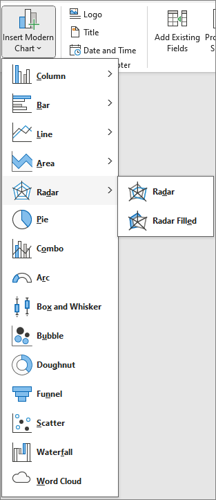
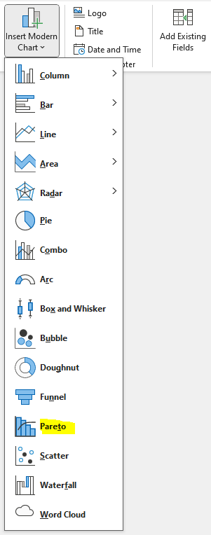
As all the Modern Charts are based on the Ivy framework, it is now relatively easy to add new chart types where there is sufficient demand for one of the available types.
Modern Chart Types (v2409)
|
Updated Modern Chart Types (v2411)
|

a) Pareto Return To Top
Following a request from JtrilloJ at Access World Forums , the Pareto chart type was added to the list of available chart types.
This work was completed in less than a month!
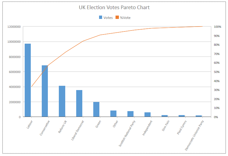
Pareto charts are a special type of combo chart with descending columns and an ascending line. They are a powerful tool used in quality control and decision-making.
Key Features:
Combination of Bar and Line Graphs: The bars represent individual values in descending order, while the line represents the cumulative total.
Descending Order: The bars are arranged in descending order from left to right, making it easy to identify the most significant factors.
Cumulative Line: The line graph shows the cumulative percentage of the total number of occurrences, helping to visualize the cumulative impact of the factors.
80/20 Rule: The Pareto Principle states that roughly 80% of effects come from 20% of causes. This helps in identifying the most critical issues to address.
Dual Axes: It has two vertical axes: one for the frequency of occurrence (left) and one for the cumulative percentage (right).
Highlighting Priorities: By highlighting the most significant factors, it helps prioritize efforts and resources to address the most impactful issues first.
These features make Pareto charts an effective tool for identifying and prioritizing problems, so that efforts are focused on the areas with the greatest impact.
You can find more details on creating Pareto charts in Excel: Create a Pareto chart
Common Uses:
Quality Control: Identifying the most significant defects or problems in a manufacturing process to focus improvement efforts.
Customer Service: Analyzing customer complaints to determine the most frequent issues and address them to improve customer satisfaction.
Inventory Management: Identifying the most frequently used items in inventory to optimize stock levels and reduce carrying costs.
Project Management: Prioritizing tasks or issues based on their impact on the project's success.
Healthcare: Analyzing patient complaints or errors to improve service quality and patient safety.
Sales and Marketing: Identifying the most effective sales strategies or the most common reasons for lost sales to improve performance.
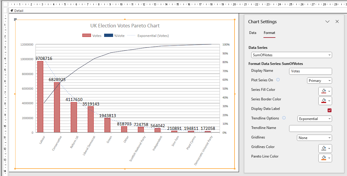
The Pareto Chart Setting Format tab items are used to set the series display names, border/fill colors, gridline types/colors, show/hide data labels and trendline type.
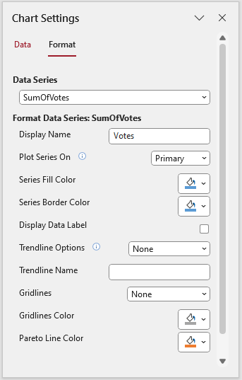
An option to change the Pareto line thickness (as for line charts) will be included in a future update.
The chart below shows additional customization including data labels, major/minor gridlines and an exponential trendline.

b) Future Developments Return To Top
As stated above, other chart types may be added in the future if there is sufficient demand.
I have requested that the (oddly named) Treemap chart type be added next.
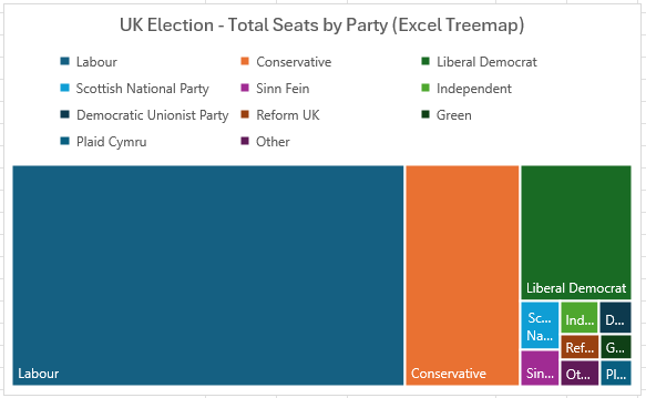
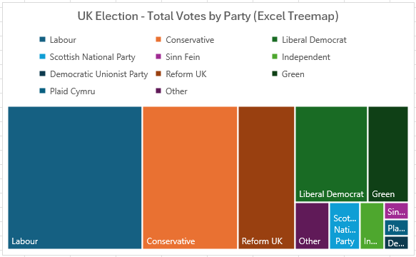
A treemap chart is a powerful visualization tool that displays hierarchical data using nested rectangles.
Here are two examples of Treemap charts created in Excel comparing the distribution of pariamentary seats and votes from the 2024 UK General Election
|
|

New & Improved Features Return To Top
Additional functionality has been included which continues to improve the usefulness of the modern charts feature.
Sorting and trendline features have been added and gridlines have been significantly enhanced.
a) Sorting Return To Top
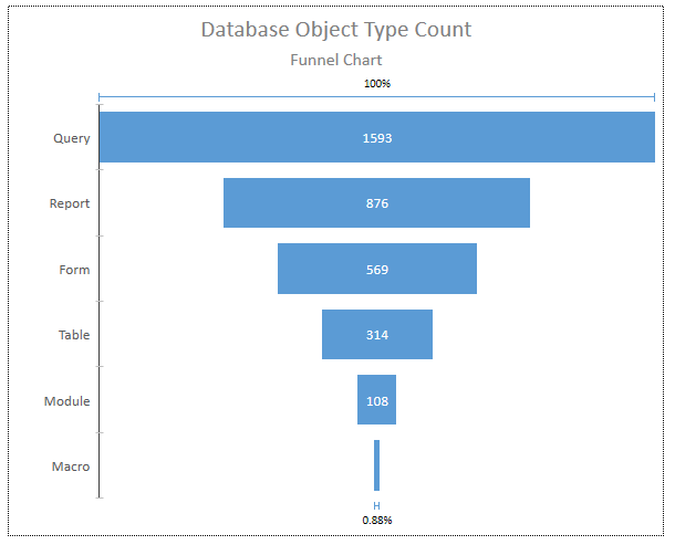
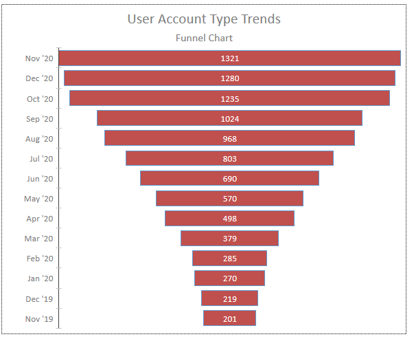
Almost all chart types can now be sorted with ascending / descending / none options. By default no sorting is applied.
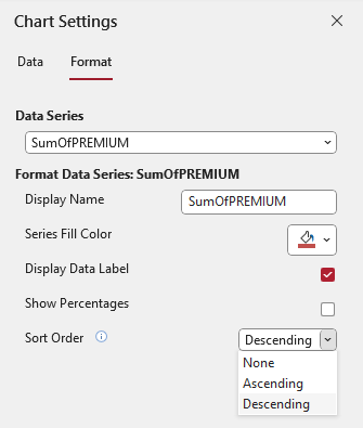
The impetus for doing this was originally to make the funnel chart type function as intended:
|
|
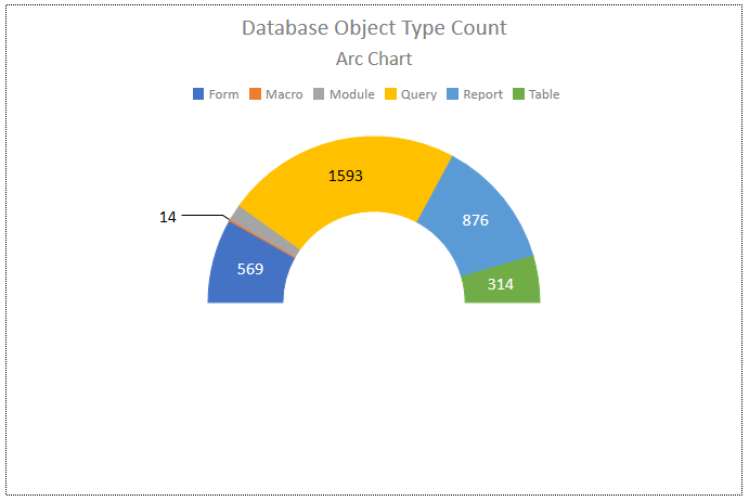
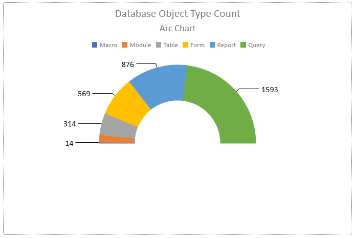
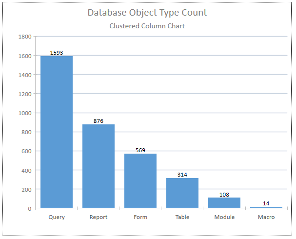
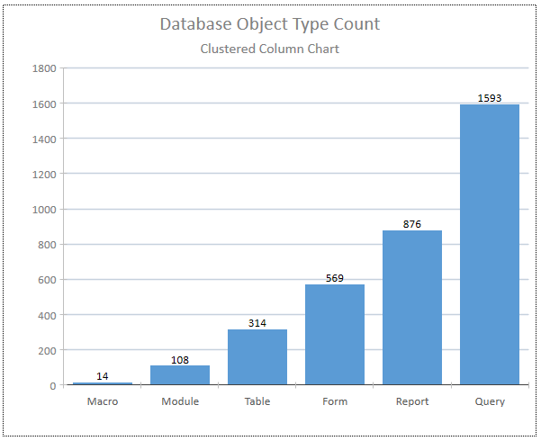
However, as sorting is useful in most chart types it has been added wherever appropriate, For example:
Arc Chart (Unsorted)
|
Arc Chart (Ascending Sort)
|
Column Chart (Descending Sort)
|
Column Chart (Ascending Sort)
|
NOTE:
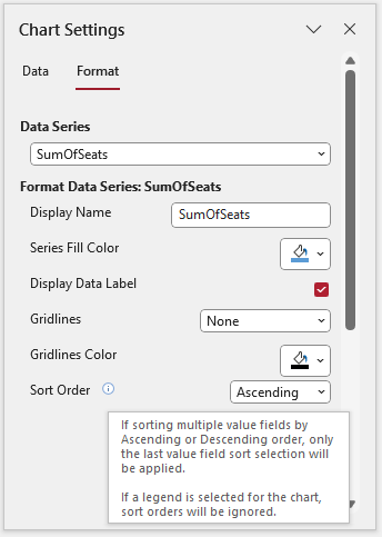
• If your chart contains multiple data series, the sort order from the last series will be applied.
• If a legend is added to the chart, the sort order will be ignored.
This information is displayed as control tip text when you hover over the small icon next to the Sort Order label:

Gridlines Return To Top
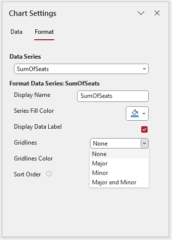
Gridlines have had a significant makeover with the following new options:
• Major & Minor gridline option added to the existing Major, Minor & None. By default, no gridlines are added.
• Major gridlines are slightly wider to emphasise them.
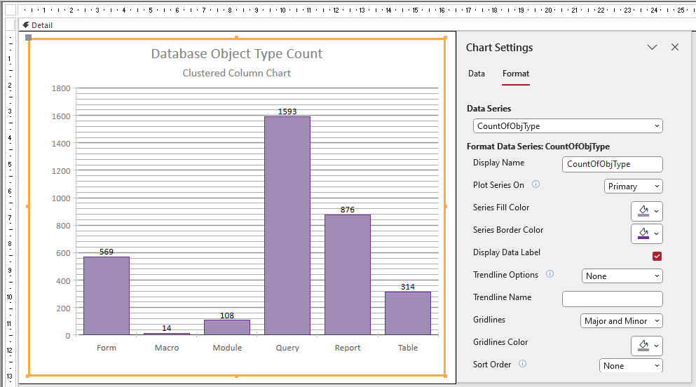
• Gridline colors can be chosen using a color palette
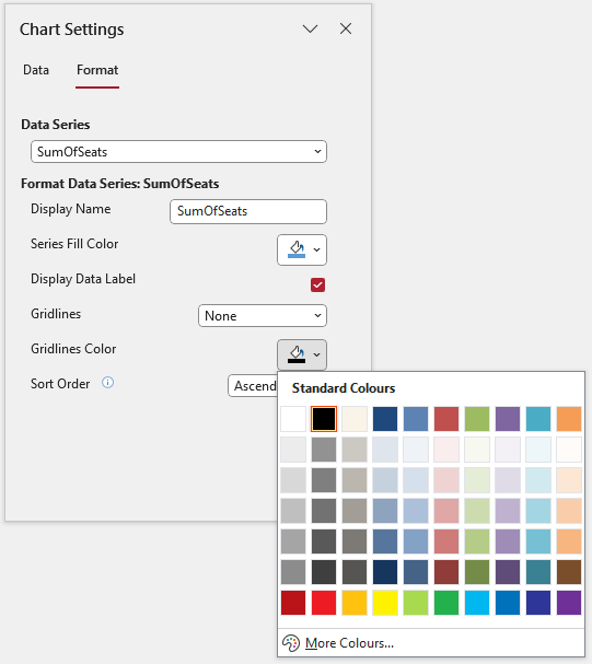
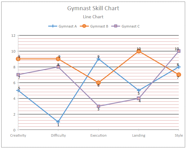
If you have more than one series, the gridline option / color will be that chosen for the final series.
However, you can select different colors if you choose Major gridlines for one series and Minor for another series.
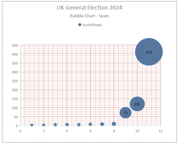
• Gridlines are now both horizontal and vertical in selected charts

VBA Support Return To Top
VBA support for the new features is not yet available. However, this will be added in a forthcoming update, hopefully by the end of 2024.
I will update this article again when this happens.

Video Return To Top
COMING SOON

Conclusions Return To Top
The latest improvements are very welcome and further enhance the modern charts feature. Further enhancements are planned.
Their advantage has always been the ease of use compared to the old 'classic' charts although those will continue to be available.
With a wide range of chart types now available and the much greater customization than in the past, it is likely that a far greater proportion of developers will now make more use of the modern charts features based on the Ivy Chart framework.

Feedback Return To Top
Please use the contact form below to let me know whether you found this article interesting/useful or if you have any questions/comments/suggestions about the improved Modern Charts feature.
Please also consider making a donation towards the costs of maintaining this website. Thank you
Colin Riddington Mendip Data Systems Last Updated 23 Nov 2024

Return to Access Articles Page
Page 2 of 2
1
2
Return To Top
|
|
|