First Published 27 Aug 2024 Last Updated 22 Jan 2025 Difficulty level: Easy

Section Links:
Introduction
New Chart Types
Area
Radar
Arc
Box & Whisker
Bubble
Doughnut
Funnel
Scatter
Waterfall
Word Cloud
Pareto
New Features
Improved Data Labels
Gridlines
Issues
Conclusions
Video
Feedback

Introduction
Return To Top
As mentioned in my earlier article, Two New Access Features Are Now Available in the Beta Channel, two significant new features have been released this Autumn.
Prior to general release, both features had been available to the two 'Insider Channels', Beta and Current Channel (Preview), for about two months with significant changes made in response to user feedback.
This article describes the Modern Chart Improvements feature which was rolled out to current channel users in late September with version 2409 build 18025.20104.
Since then, the feature has continued to evolve in response to user feedback and suggestions for additional functionality.
The Access team member responsible for this feature has been very responsive to making changes which further improve the usefulness of this feature.
This article focuses on the features available in the initial release to the current channel in late September and early October.
The second part of this article describes the additional changes made subsequently from November 2024 onwards.
The third part of this article will discuss the use of VBA code to modify the properties of modern charts, including at runtime.
A shorter version of this article is available on the Access Forever blog site
See the separate article on the Monaco SQL Editor for details of that feature which was released at the end of October 2024.
The Modern Chart Improvements include:
1. 11 new chart types: area / radar / arc / box and whisker / bubble / doughnut / funnel / pareto / scatter / waterfall / word cloud
2. Additional features in existing / new charts:
• gridlines in column / bar / line / area / combo / radar / box & whisker / bubble / scatter and waterfall charts
• ascending / descending sorting option in most chart types
• number or percentage data labels in pie / arc / doughnut charts
• an additional Chart Settings Format task pane with features that depend on the chart type in use
All these changes are based on a common charting framework called Ivy which has been integrated into the Access application.
This will make it easier to continue adding new chart types in the future.
The official Microsoft documentation has just been updated with details of the new chart types and other improvements.
The official documentation for the Access Chart Object is still being updated and should be completed by the end of 2024.
NOTE:
a) These changes are only being implemented in Access 365.
For users running Access 2016/2019/2021/2024, the new chart types will revert to the default Combo chart type.
b) Users running Access 2013 or earlier cannot see any modern charts. The application will still run, but there will be an empty space where the modern chart is located.

Existing Modern Chart Types (v2408)
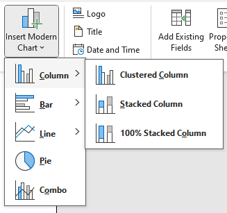
| New Modern Chart Types (v2409)
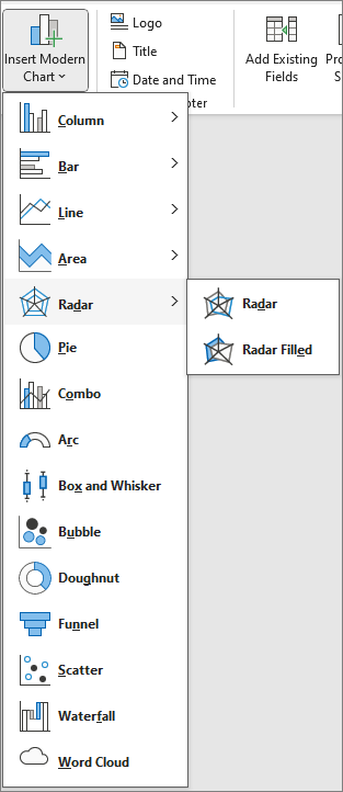
|

New Chart Types
Return To Top
Each chart type is particularly suitable for certain types of data. I used CoPilot to assist with describing the features for several chart types and to provide useful links.
a) Area
Return To Top
Area charts combine elements of both line and bar charts, with the area between the line and the axis filled in with color.
They are particularly effective for showing trends over time and comparing different data sets.
As with Column, Bar and Line charts, there are 3 different types of Area chart:
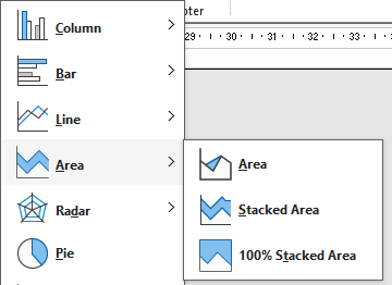
Common uses for area charts include:
• Displaying Trends Over Time: very useful for showing how values change over a period. For example, to show the growth of a company’s revenue over several years.
• Comparing Multiple Data Series: By stacking multiple areas on top of each other, you can compare different data series and see how each contributes to the total.
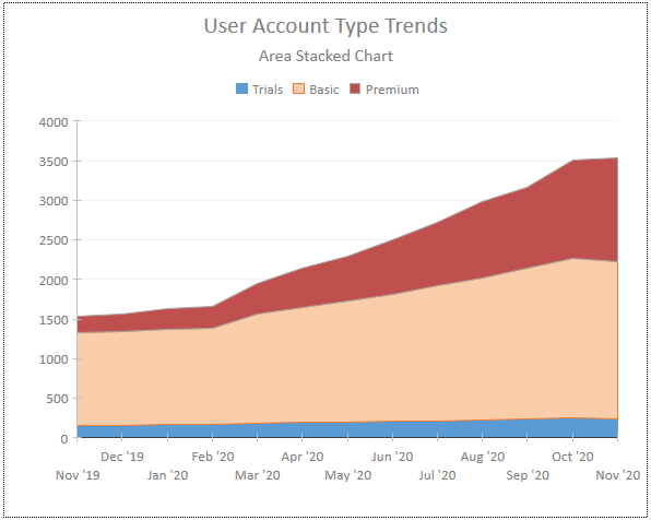
• Highlighting Volume Changes: The filled area helps to emphasize the magnitude of changes, making it easier to see the volume of data at different points in time
As with all modern charts, the Area Chart Setting Task Pane has two tabs - Data and Format. The Data tab items vary according to the chart data used
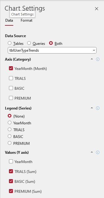
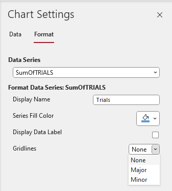
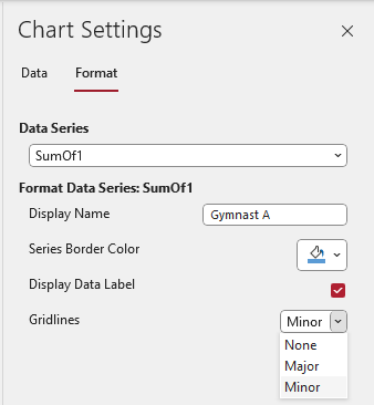
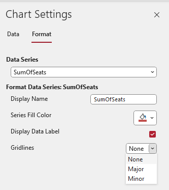
The Format tab items reflect the chart type in use. You can change the display name, set the fill color, show/hide data labels and select gridline type (none/major/minor)
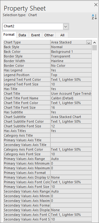
In addition, the property sheet allows editing of chart title / subtitle and legend text as well as font size / color
For more information, see A complete guide to area charts and What is an area chart and when to use it?

b) Radar
Return To Top
Radar charts (also known as spider or web charts) are used to visualize multivariate data. Common uses include:
• Comparing Multiple Variables: display different variables across multiple categories where each axis represents a different variable.
The data points are connected to form a polygon, making it easy to see how each variable compares to others.
• Identifying Strengths and Weaknesses: often used in performance analysis to highlight strengths and weaknesses.
For example, to show how a product performs across various attributes like price, quality, and customer satisfaction
• Visualizing Patterns and Trends: help to identify patterns and trends within the data.
This is particularly useful in fields like sports analytics, to compare the performance of different players or teams across various metrics
• Displaying Cyclic Data: display data that follows a cyclic pattern, such as seasonal performance metrics or periodic survey results
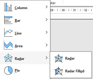
There are 2 different types of Radar chart:
For example, this radar chart displays the scores for 3 gymnasts in 5 different skill areas.
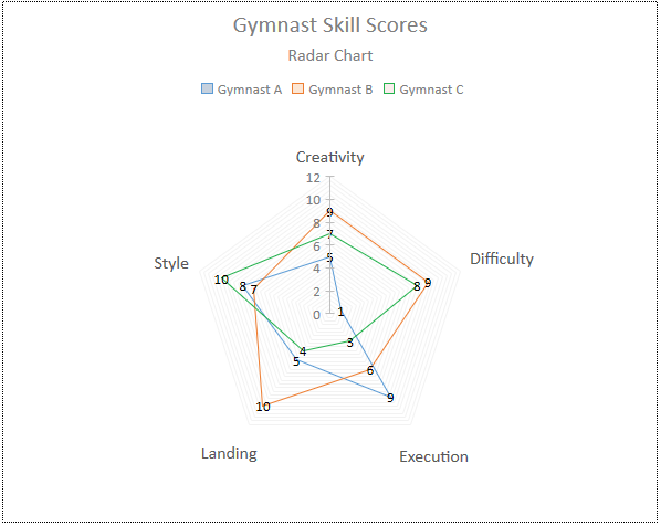
The Radar Chart Setting Format tab items are almost identical to those for area charts.
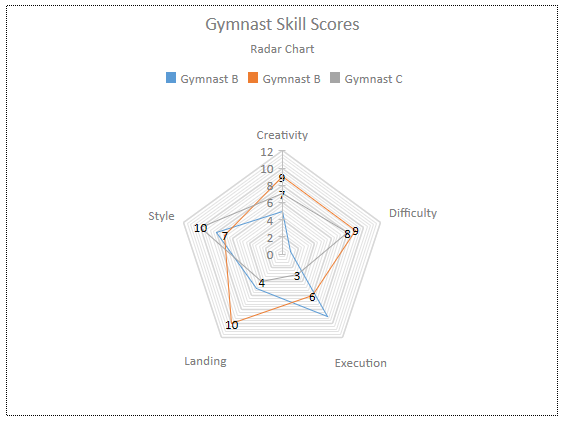
To customize the 'spider web' layout, apply the gridlines to the final chart series. In this case, Gymnast C.
|
|
For more information, see What is A Radar Chart with Examples

c) Arc
Return To Top
Arc charts are often used as an alternative to pie charts.
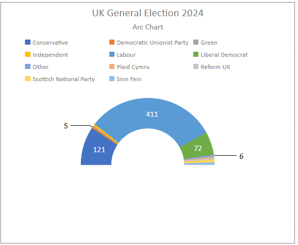
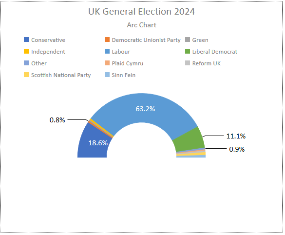
They are often used to show the distribution of seats for each party in an election. For example, the results of the UK Election in July 2024
|
|
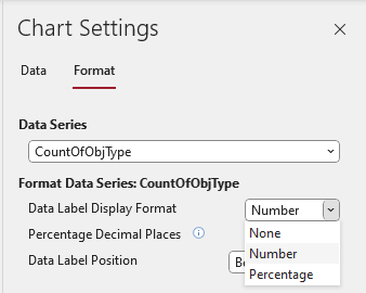
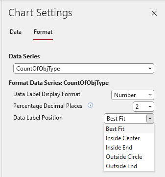
The Arc Chart Setting Format tab items are used to set the type, precision and position of data labels.
Data labels can be numbers or percentages (but not both). The number of decimal places can be specified.
|
|
Ideally, the chart colours would match those for each party e.g Labour (red), Liberal Democrat (yellow) and Green (green!) etc.
Unfortunately, (as for pie charts), it is not possible to specify the colours for each data point in arc charts.
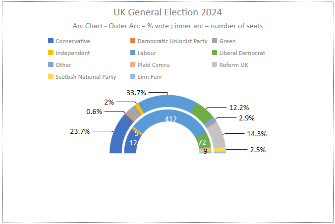
However, one significant advantage of Arc charts over Pie charts is that two or more data series can be plotted simultaneously.
For example, the Arc chart below shows both the number of seats and the % vote for each party. Each arc is formatted independently.

d) Box and Whisker
Return To Top
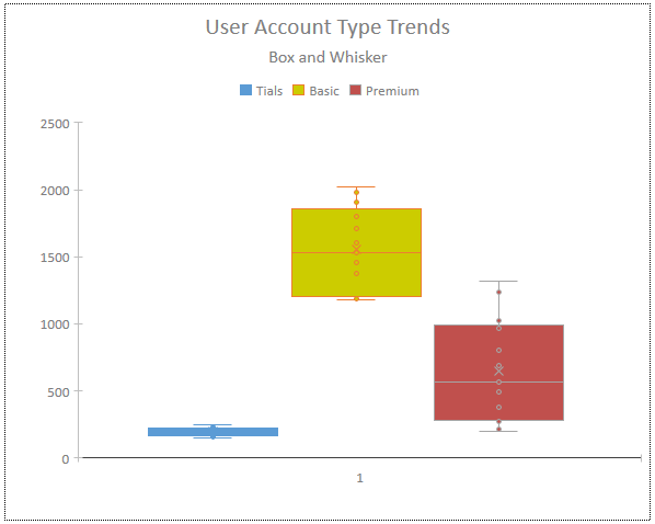
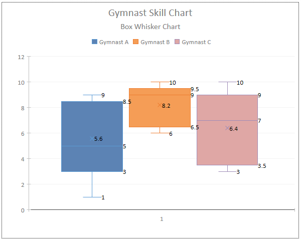
Box and whisker charts, also known as box plots, are used to display the distribution of a dataset. These highlight the median, variability, and skewness of the data.
Key Components:
Box: The main part of the chart, which shows the interquartile range (IQR) – the middle 50% of the data.
Median Line: A line inside the box that represents the median (the middle value) of the dataset.
Whiskers: Lines extending from the box to the smallest and largest values within 1.5 times the IQR from the lower and upper quartiles, respectively.
Outliers: Data points outside the whiskers, often marked with dots or asterisks.
Uses:
Comparing Distributions: compare the distributions of different datasets side by side.
Identifying Outliers: help identify outliers in the data, which can be crucial for statistical analysis.
Visualizing Spread and Skewness: provide a clear visualization of the spread and skewness of the data, showing how data is distributed around the median.
|
|
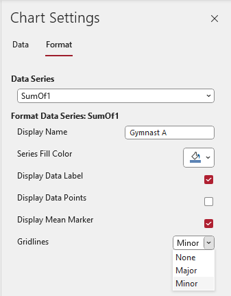
The Box and Whisker Chart Setting Format tab items are used to set the display name, fill color, show/hide data labels, data points, the mean marker and gridlines.
For more information, see:
Create a box and whisker chart and
A complete guide to box plots

e) Bubble
Return To Top
Bubble charts, also known as bubble plots display three dimensions of data in a single plot.
Key Features:
Three Dimensions: each data point is represented by a bubble, where the x-axis and y-axis represent two dimensions of the data.
The size of the bubble represents the third dimension.
Variable Bubble Sizes: the size of each bubble can vary, providing an additional layer of information about the data.
Common Uses:
Comparing Relationships: excellent for comparing relationships between three variables.
For example, you can use them to compare sales, profit, and market share across different products.
Identifying Patterns and Outliers: help identify patterns, trends, and outliers within the data, making it easier to spot anomalies or significant data points.
Visualizing Complex Data: useful for showing complex datasets where multiple variables need to be compared simultaneously.
Here are the UK Election results as a bubble chart. For this chart type, the individual data point colors ARE customizable!
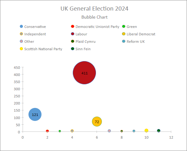
Currently, bubble charts are two dimensional only with the bubble size depending on the Y-axis value. In Excel, the bubble size can represent a third data item.
This issue has been raised with the Access team and is currently under review.
At present, the Bubble Chart Setting Format tab items are identical to those for Area charts to set the display name, fill color, show/hide data labels and set gridlines.
For more information, see:
Present your data in a bubble chart and A complete guide to bubble charts

f) Doughnut
Return To Top
This is another variation on a pie chart. It is just a pie chart with a hole!
Key Features:
Circular Shape with a Hole: The chart is divided into segments, with each segment representing a proportion of the whole.
The hole in the center can be used to display additional information or simply to improve readability.
Multiple Data Series: Unlike pie charts, doughnut charts can display more than one data series, with each series represented by a ring.
Common Uses:
Showing Proportions: ideal for showing the relationship of parts to a whole, making them useful for visualizing survey results, market share, or budget allocations.
Comparing Categories: help to compare different categories within a dataset, especially when you have multiple data series to display.
Here are the UK Election results as a doughnut chart
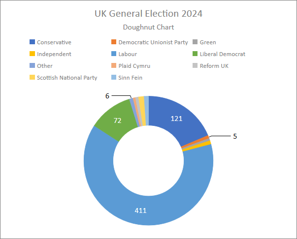
These have exactly the same functionality and limitations as for Pie and Arc charts.
The Doughnut Setting Format tab items are, unsurprisingly, identical to those for Pie and Arc charts. They are used to set the type, precision and position of data labels.
Once again, data labels can be numbers or percentages (but not both). The number of decimal places can be specified.

|

|
As with Arc charts, in Doughnut charts two or more data series can be plotted simultaneously.
For example, the Doughnut chart below shows both the number of seats and the % vote for each party. Each ring is formatted independently.
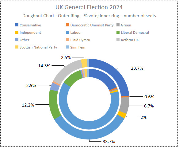
The chart clearly shows that in the UK 'first past the post' electoral system, the number of seats do not completely tally with the number or % of votes cast.
For more information on doughnut charts, see:
Present your data in a doughnut chart and Complete Guide: What is Doughnut Chart

g) Funnel
Return To Top
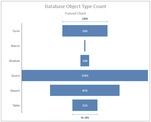
Funnel charts are used to visualize the progressive change in data as it moves through stages in a process.
Key Features:
Funnel Shape: The chart usually starts with a broad head and narrows down to a smaller neck, resembling a funnel.
Each stage of the process is represented by a segment of the funnel.
Stage Representation: The width of each segment corresponds to the value or number of items at that stage. Typically, the values decrease as you move down the funnel
Common Uses:
Sales and Marketing: use to represent sales pipelines, showing how potential customers move through stages from initial contact to final purchase
Cnversion Rates: track conversion rates in processes like website visits. See how many visitors move from one stage to the next e.g. from landing page to checkout
Process Analysis: help identify bottlenecks or drop-off points in any process, allowing businesses to focus on areas that need improvement.
|
|
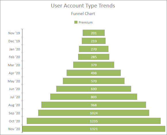
In my tests so far, I have been unable to sort the funnel chart in the standard way (with the largest values at the top and decreasing vertically).
The funnel chart sort issue has been raised with the Access team and sorting (ascending/descending/unsorted) will be added in a future update.
UPDATE 23 Nov 2024: Funnel sorting has been fixed in version 2412. See the second article in this series.
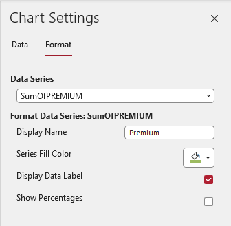
The Funnel Chart Setting Format tab items are used to set the display name, fill color, show/hide data labels and percentages.
For more information, see:
A complete guide to funnel charts

h) Scatter
Return To Top
Scatter charts, also known as scatter plots / diagrams, use Cartesian coordinates to display values for (typically) two variables for a set of data.
Key Features:
Data Points: Each point on the chart represents an observation from the dataset, plotted along the x-axis and y-axis based on its values for the two variables
Correlation: useful for identifying the relationship or correlation between the two variables.
The pattern of the points can indicate whether the variables have a positive, negative, or no correlation
Trend Lines: You can add trend lines to a scatter chart to highlight the overall direction of the data and make it easier to see patterns
Common Uses:
Identifying Relationships: often used to identify and visualize relationships between two continuous variables.
For example, to see if there’s a correlation between advertising spend and sales revenue
Detecting Outliers: help detect outliers or unusual observations in the data. This can be important for data analysis and quality control
Regression Analysis: commonly used to visualize the fit of a regression model and assess how well it explains the relationship between the variables.
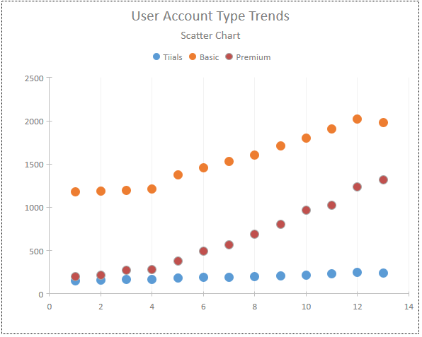
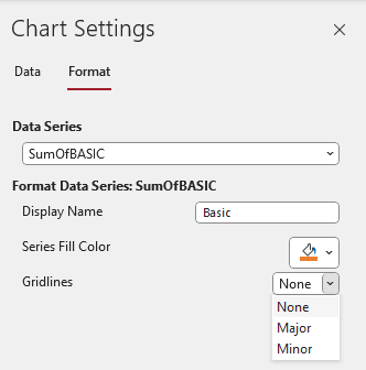
The Scatter Chart Setting Format tab items are used to set the display name, fill color and gridlines.
Currently, Scatter Charts cannot be sorted. This may not be an issue as, in many cases, it wouldn't make sense to sort a scatter chart.
For more information, see:What is a Scatter Chart? and Scatter Charts: The Ultimate Guide

i) Waterfall
Return To Top
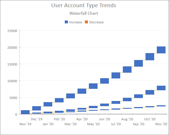
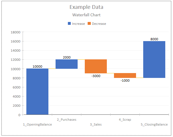
Waterfall charts, also known as cascade or bridge charts, help illustrate how an initial value is affected by a series of intermediate positive or negative values.
Key Features:
Sequential Changes: show the cumulative effect of sequentially introduced positive or negative values, leading to a final result.
Color Coding: columns are color-coded to differentiate between positive and negative changes, making it easy to see the impact of each step.
Floating Columns: Intermediate values are represented by floating columns, while the initial and final values often start on the horizontal axis.
Common Uses:
Financial Analysis: frequently used in finance to show how different factors contribute to a final net value, such as changes in revenue, expenses, and net income
Inventory Management: show how starting inventory levels are affected by additions and subtractions over time.
Project Management: useful for tracking the progress of a project by showing how various tasks and milestones contribute to the overall completion.
|
|
Sorting the data correctly (as in the right screenshot) can be a bit tricky. For that chart, I used a query with concatenated data on the x-axis (Category).
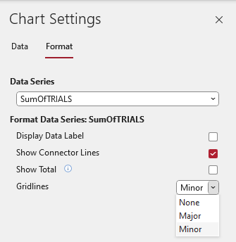
The Waterfall Chart Setting Format tab items are used to show/hide data labels, connector lines and totals as well as set gridlines.
For more information, see:Create a waterfall chart and Waterfall Chart: From Initial Value to Final Insight

j) Word Cloud
Return To Top
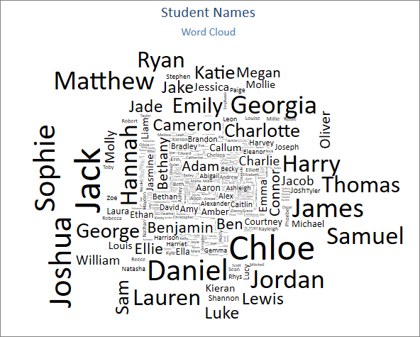
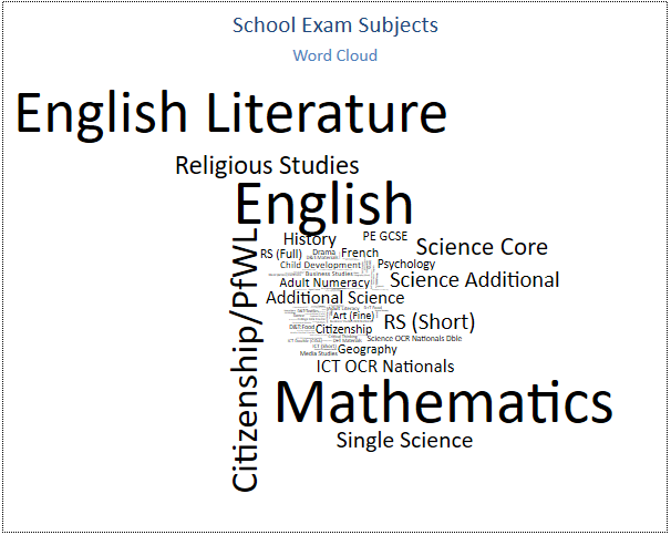
Word cloud charts, also known as a text or tag clouds, display text data where the size of each word indicates its frequency or importance.
Key Features:
Word Size: The font size of each word corresponds to its frequency or significance in the source text. Larger words appear more frequently or are more important.
Visual Appeal: can be customized with different fonts, colors, and shapes to enhance their appearance.
Common Uses:
Text Analysis: often used to analyze lengthy text, such as survey responses or customer reviews, to quickly identify the most common words and themes.
Summarizing Content: provide a quick visual summary of the main topics or keywords in a document, making it easier to grasp the overall message.
Presentations and Reports: can be used in presentations and reports to highlight key points and make the content more engaging.
|
|
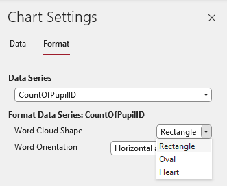
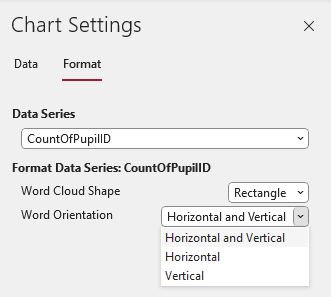
The Word Cloud Chart Setting Format tab items are used to set the cloud shape (rectangle / oval / heart) and word orientation (horizontal / vertical / both)
Unfortunately, there is no option to change the cloud text color. As Henry Ford once famously said, you can have any color you like as long as it is black!
|
|
There is a known issue that Word Cloud charts currently do not appear in print preview or when printed.
UPDATE 21 Jan 2025: Fixed in the Beta Channel version 2502 build 18514.20000 released on 17 Jan 2025.The fix will roll through to other channels in the coming weeks/months.
For more information, see:Words in Clouds to Improve Decision-Making

k) Pareto (version 2412)
Return To Top
UPDATE 23 Nov 2024: The Pareto chart type was also added in version 2412. For further details, see the second article in this series.

New features
Return To Top
These are in response to frequent requests from developers over a number of years:
a) Improved data labels
Return To Top
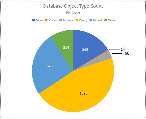
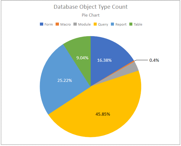
Pie / arc and doughnut charts can now have either number or percentage values as labels. The number of decimal places is customizable
|
|
The label colours are either black or white and neither colour nor font size is customisable
This means the appearance is somewhat different to the style of the other chart items
Occasionally, data labels are missing for no obvious reason. For example, the % value for the grey segment in the pie chart on the right.
I have requested that these issues be addressed. This is currently being investigated .
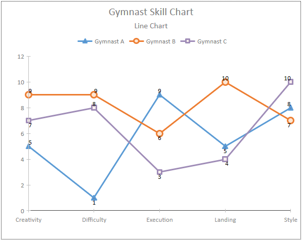
Similar improvements are available for labels in other chart types. For example, modifying the data point shape and line thickness in line charts:

b) Gridlines
Return To Top
This feature should have been included when the original modern charts feature was added in 2016.
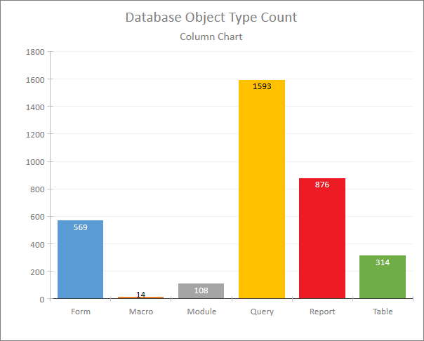
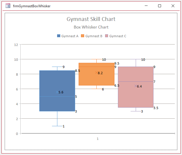
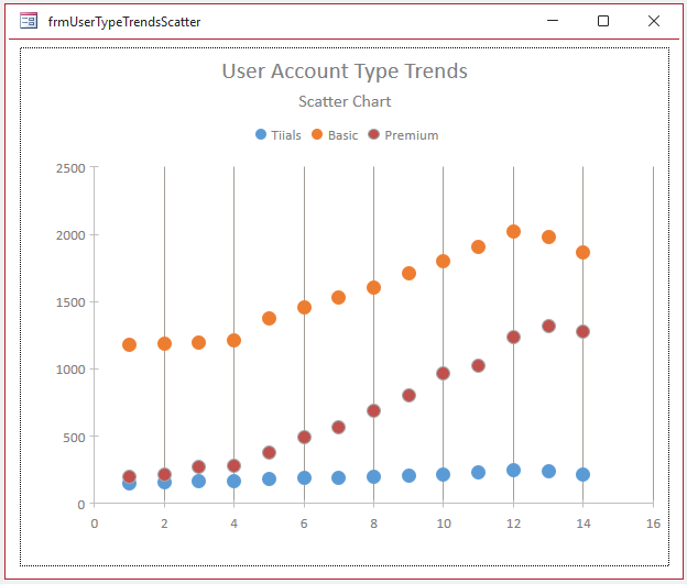
Unfortunately, although added to 10 chart types, the initial release to current channel was of limited use as the gridlines were very faint. This was an accessibility issue.
|
|
The gridline colours have since been changed to a darker grey starting with current channel version 2409 build 18025.20140 released on 8 Oct.
The colour change applies to all chart types that support gridlines. For example:
|
|
Limitations:
Gridlines are only available in one direction - horizontal or vertical (depending on the chart type)
At present, gridlines cannot be set using code. VBA support will be added in the coming months
UPDATE 23 Nov 2024: There have been further improvements to gridlines in version 2412.
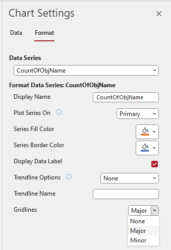
There is now a Major / Minor gridline option and gridline colors may now be changed using a color palette. Selected chart types now have vertical and horizontal gridlines.
For further details, see the second article in this series.

Issues
Return To Top
The Access team have worked with MVPs and other early adopters to fix the few reported bugs that have been noticed in early testing.
At the time of writing, the following issues are still outstanding:
a) sorting data (ascending / descending) in various chart types e.g. funnel, combo (Pareto) etc. FIXED in version 2412
b) bubble size linked to a third data value in bubble charts
c) adding VBA support for all the new chart types and features
d) printing support for Word Cloud charts
The above items should all be completed over the next 3-4 months together with updating the Access Chart Object documentation.
As with any new feature, there may be some remaining bugs that will be discovered once the new charts are tried out by a larger number of users in the current channel.
If you do discover any bugs, please use the Feedback button below to provide me with the details. I will pass on any issues to the Access team

Conclusions
Return To Top
The new improvements are very welcome and significantly enhance the modern charts feature.
Their advantage has always been the ease of use compared to the old 'classic' charts which will continue to be available.
However, until now, the range of chart types available and the degree of customisation has been very limited compared to 'classic' charts.
For many years, a significant proportion of Access developers have largely ignored the modern charts feature that was introduced with Access 2016.
Alternatives include:
a) continuing to use 'classic' Access charts
b) exporting data to Excel to make use of its more advanced charting features
c) using Thomas Moeller's Better Access Charts based on Javascript - see Better-Access-Charts (Github) and Better Access Charts – The Next Generation
Whilst the alternatives will continue to be used, it is likely that a far greater proportion of developers will now make use of the much improved modern charts features based on the Ivy Chart framework.

Video
Return To Top
Fellow MVP, Maria Barnes, recently gave a presentation on Modern Chart Improvements to the Access Lunchtime chapter of AccessUserGroups.org.
The session was recorded and the video is now available on the Access Lunchtime YouTube channel at https://youtu.be/7RYQutxuhRc or you can click below:
The presentation is well worth watching if you missed it . . . and to watch again if you were present!

Feedback
Return To Top
Please use the contact form below to let me know whether you found this article interesting/useful or if you have any questions/comments.
Please also consider making a donation towards the costs of maintaining this website. Thank you
Colin Riddington Mendip Data Systems Last Updated 22 Jan 2025

Return to Access Articles Page
Page 1 of 3
1
2
3
Return To Top
|
|
|